
How to Design a Website With AI: A Step-by-Step Workflow for Founders
How to Design a Website With AI When You Have Three Days and No Designer Budget
Your product is ready. The pitch deck is polished. The investor call is in 72 hours. You don't have $5,000 for a designer, and you're not waiting six weeks for an agency to slot you in. Figuring out how to design website with ai feels like the obvious move — except the last three times you tried, you burned an afternoon and shipped nothing usable.

Three failure modes catch founders trying to design website without designer support:
- You open a builder — Wix, Squarespace, Framer — and stare at a blank canvas for four hours.
- You generate thirty versions in an ai website builder and end up with something that "looks like every other AI site."
- You ship something fast and watch it pull zero qualified leads because structure was an afterthought.
This is a 7-step workflow that takes you from blank canvas to a credible, conversion-ready homepage with an integrated content engine — using the best AI for building a website that already exists today. Framer, Webflow, v0 by Vercel, Claude, MidJourney. This is not a tool review. It's a workflow blueprint.
The founders who win with AI design aren't the ones with the best prompts. They're the ones with the clearest brief before they ever open a tool.
Table of Contents
- Lock Your Website's Core Purpose Before You Open a Single AI Tool
- Pick Your AI Design Stack — Visual Editor or Code-Generated
- Generate a Locked Visual Direction Before You Build Anything
- Build the Homepage Structure With AI Page Templates and Section Prompts
- Generate On-Brand Images That Don't Look AI-Generated
- Plug In an AI Content Engine So Your Site Stays Live, Not Stale
- Common AI Website Pitfalls — and the Fix for Each
Lock Your Website's Core Purpose Before You Open a Single AI Tool
AI design tools are amplifiers. They accelerate whatever direction you point them in, including the wrong one. A founder who skips this step regenerates designs five to eight times and burns six to ten hours on "iteration" that's actually indecision dressed up as productivity.
Before you touch a tool, pin down your archetype. Three patterns cover most founder situations:
- The B2B SaaS Founder. Primary goal is demo bookings. Audience expects case studies, integrations, ROI math. Essential pages: home, product, pricing, demo. Conversion endpoint: Calendly or HubSpot form.
- The Local Service Owner. Primary goal is qualified calls or bookings. Audience expects service area transparency, real reviews, pricing clarity. Essential pages: home, services, about, contact. Conversion endpoint: phone tap or contact form.
- The Indie Product Builder. Primary goal is email list growth or paid signups. Audience expects clear product demo, founder story, social proof. Essential pages: home, features, pricing. Conversion endpoint: Stripe checkout or email capture.
This matrix is your brief. Every prompt you feed downstream — to Claude, to Framer, to MidJourney — references this. Without it, prompts go vague, outputs drift, and you spend the gain in AI speed on rework.
| Founder Archetype | Primary Goal | Essential Pages | Conversion Endpoint | Voice Tone |
|---|---|---|---|---|
| B2B SaaS Founder | Book demos | Home, Product, Pricing, Demo | Calendly / Form | Direct, expert |
| Local Service Owner | Get calls/bookings | Home, Services, About, Contact | Phone / Form | Warm, trustworthy |
| Indie Product Builder | Email or paid signups | Home, Features, Pricing | Stripe / Email capture | Personal, candid |
The matrix is not optional. It's the difference between a website design workflow that ships in three days and one that hemorrhages weekends. When prompts are vague — "design a SaaS landing page for me" — the model averages toward its statistical mean. You'll get a generic teal hero, three feature columns, and a stock photo of a smiling team. Specificity in the brief is what produces specificity in the output. If you need a primer on the mechanics, here's how to write prompts that produce accurate, source-backed outputs.
Here's the directive that closes this step: write your archetype, primary goal, and conversion endpoint on a sticky note. Stick it next to your monitor. That sticky note is now your design brief for the rest of this workflow.
Pick Your AI Design Stack — Visual Editor or Code-Generated
The tool choice on every ai website builder decision comes down to one binary question: do you want to ship a site you can edit visually forever, or do you want code you'll deploy to Vercel or Netlify and edit in an IDE?
Most founders should choose visual. Code-generated is only better if you already write code, or if your site needs heavy custom logic that visual editors fight with.
Here's what each tool actually outputs:
- Framer. Visual editor with built-in AI page generation. Type a prompt, it produces a full responsive page you can edit by clicking. Ships at a framer.com subdomain or your own domain.
- Webflow + Webflow AI. Visual editor with AI assist for sections, copy, and styles. Steeper learning curve than Framer, more powerful for content-heavy sites and CMS work.
- v0 by Vercel. Generates React and Tailwind code from a prompt. You copy code into a Next.js project. Best if you already deploy code.
- Wix ADI and Squarespace AI. Fully automated builders. Fastest to live site, weakest at standing out.
- Lovable and Bolt.new. AI app builders generating full code stacks. Useful when the product and marketing site are one combined ai web design tools deployment.
| Tool | Output Type | Time to Live Site | Coding Required | Best For |
|---|---|---|---|---|
| Framer | Visual + hosted | 2–6 hours | No | Fast investor-ready sites |
| Webflow + AI | Visual + hosted | 6–12 hours | Light | Content-heavy marketing sites |
| v0 by Vercel | React/Tailwind code | 4–10 hours | Yes | Code-fluent founders |
| Wix ADI | Visual + hosted | 1–3 hours | No | Placeholder/MVP sites |
| Lovable / Bolt.new | Full-stack code | 6–24 hours | Light | App + marketing combos |

Once the site is live on Webflow, Framer, WordPress, Shopify, or Wix, the next gap is keeping it current. An automated SEO blog writer like AymarTech plugs in as the content engine — auto-publishing fact-checked posts daily to the connected CMS, supporting 150+ languages, and inserting smart internal links so the site keeps ranking without manual upkeep.
For a 72-hour deadline, Framer or Webflow wins. Framer is faster for a pure homepage and design-led layout; Webflow is stronger if you know you'll be publishing 30+ blog posts and need real CMS structure. If you already ship code, v0 is faster than any visual editor — it skips the UI middle layer entirely. Wix and Squarespace AI ship fastest of all, but produce the most generic output. Fine for a placeholder, weak for an investor-facing site. If you want a deeper breakdown, here's our take on how to design website with ai using the best AI tools for building and ranking a site in 2026.
Generate a Locked Visual Direction Before You Build Anything
Skip this step and you'll pay for it later. Founders who go straight to building regenerate the homepage five or more times because each new section "doesn't match" the last. The fix is locking visual direction first — colors, typography, spacing, imagery style — in roughly 90 to 120 minutes of focused work, before a single page block gets built.
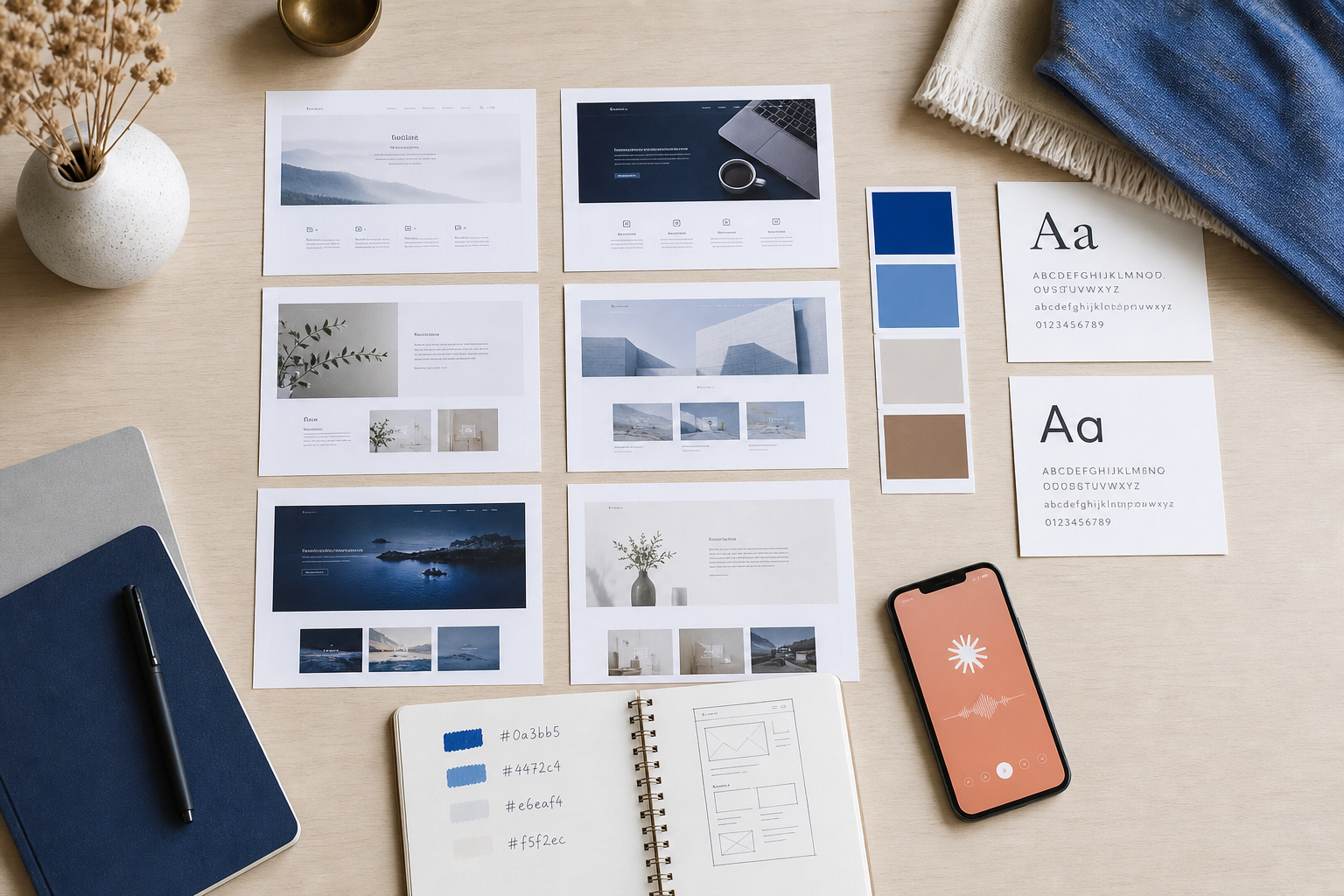
The process is concrete. Call it the Reference Stack Method:
- Collect five to eight reference sites you admire. Mix three competitors, three aesthetic inspirations, two from unrelated industries that "feel right." Screenshot the homepages.
- Open Claude or ChatGPT. Paste the screenshots, or paste URLs, with this prompt structure: "I'm building a [archetype from Step 1] site for [audience]. Here are eight sites whose aesthetic I want to channel. Analyze the common visual language across them — color temperature, typography weight, spacing density, imagery style — and produce a design system brief with exact hex codes, font pairings, and a three-sentence aesthetic description."
- The output is a functional design system: primary, secondary, and accent hex codes, a heading and body font pairing (use Google Fonts so they work in every builder), spacing rules (tight versus airy), and imagery direction (photography versus illustration, saturated versus desaturated, human-centered versus abstract).
There's an important distinction between AI image generation and AI design direction, and most founders blur it:
- MidJourney, DALL-E, Ideogram. Use these after the direction is locked, for producing specific images that fit the system.
- Claude, ChatGPT, Gemini. Use these first, to extract the aesthetic logic and write the system itself.
The order matters. Image tools generate beautiful one-offs but can't reason about coherence across a ten-section homepage. Text models can't draw, but they can architect a system every later prompt references. If you reverse the order — generate images first, then try to retrofit a system around them — you end up with a mood-board collage instead of a cohesive site. Founders who treat ai web design tools as a pipeline rather than a grab bag ship faster and rework less.
A locked visual direction takes two hours to establish and saves twenty hours of rebuild cycles. The founders who win with AI aren't the ones with the best prompts — they're the ones with the clearest brief.
One quality check before you move on. Paste the design system back to Claude and ask: "If I were a designer, what's missing from this brief?" It will surface gaps — button border radius, link hover color, error states, focus rings — that would otherwise show up as inconsistencies on page four of your ai-generated website. Twenty minutes spent here saves a half-day of "why does this section feel off" debugging later.
When the system is locked, paste it into a Notion doc or a pinned note. This document is now the second half of your brief. Every prompt downstream — copy, imagery, layout — references both the archetype sticky note and this design system. Anything that contradicts either gets thrown out, not negotiated with. Discipline at this step is what separates a credible site from a Frankenstein.
The same principle applies across every AI workflow: constraint produces quality, vagueness produces drift.
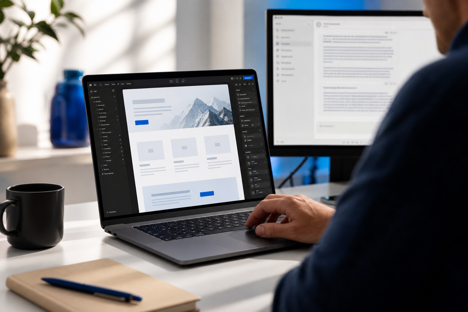
Build the Homepage Structure With AI Page Templates and Section Prompts
With the brief and the design system locked, structure becomes fill-in-the-blank instead of a blank-canvas crisis. The universal homepage skeleton below converts for all three archetypes from earlier. Adjust copy and emphasis per archetype, but the block order holds.
- Hero. Outcome-focused headline (under 12 words), subheadline naming who it's for and what changes, primary CTA button, secondary "learn more" link, hero visual.
- Social proof bar. Logos, ratings, or one strong founder testimonial.
- Problem and agitation. Two or three sentences naming the reader's current pain in their own language.
- Solution and product. Three-column or alternating feature blocks with icons or screenshots.
- How it works. Three-step process diagram. Not five steps. Not seven.
- Deeper social proof. Case study snippet or testimonial carousel.
- Pricing or primary CTA. Depends on archetype.
- FAQ. Four to six questions handling top objections.
- Final CTA. Repeats the hero CTA.
For each block, use role-based prompts. Here's a working hero example: "You are a senior conversion copywriter for B2B SaaS. The product is [name]. The audience is [archetype]. The brand voice is [3-sentence voice guide]. Write the hero section: headline under 12 words, subheadline under 20 words, primary CTA button text under 4 words. Output three variations."
Role-based prompts beat generic prompts because assigning a role narrows the model's distribution of plausible outputs. A "senior conversion copywriter" produces tighter, more outcome-focused copy than "write me a headline." The same applies to every other section: a "B2B case study writer," a "FAQ specialist for SaaS objection handling," a "pricing page strategist." You're not flattering the model — you're constraining its sampling space toward writers whose work you'd actually pay for.
The brand voice primer is what makes ai website builder copy stop sounding like a robot. Write three or four sentences describing how you actually talk. Include two or three words you favor ("specific," "candid," "direct") and two or three you ban ("revolutionary," "synergy," "seamless"). Feed this primer at the start of every copy prompt. For the deeper version of this technique, see how founders write in their own voice with AI.
Before you move on, this checklist is the quality gate for your website design workflow. Don't proceed until every item is checked.
- Hero headline, subheadline, and CTA approved and on-brand
- Social proof block populated with real logos, ratings, or one strong quote
- Problem section written in founder's voice, not AI voice
- Three feature blocks scaffolded with section-specific copy prompts
- How-it-works steps reduced to three (not five or seven)
- Pricing or final CTA decision matches archetype conversion endpoint
- Four to six FAQ entries handle top objections from real sales conversations
- Every copy block passed through the brand voice primer before approval
Generate On-Brand Images That Don't Look AI-Generated
Here's the problem with most ai-generated website imagery: generic prompts to MidJourney, DALL-E, or Ideogram produce "that AI look." Overly smooth lighting. Plastic skin. Repeated compositional clichés — centered subject, soft bokeh, golden hour. The cause is training-data homogeneity. Most users prompt with similar generic descriptors, and the model averages toward the mean.
The fix is the Style-Stack Method. Five patterns to apply, in order.
- The Style-Stack Method itself. Combine three specific references in every prompt: a named photographer or artist ("in the style of Annie Leibovitz"), a named art movement or era ("editorial 90s magazine"), and a brand or aesthetic reference ("muted Stripe-style color palette"). Three specific references force the model off its default output.
- Hero images. Use the style stack plus your product context. For a B2B SaaS, this might be "editorial photography of a developer reviewing dashboards, in the style of Annie Leibovitz, muted Linear color palette, shot on Leica Q3." Generate eight variations, pick the strongest two, refine with image-to-image. Don't accept attempt one.
- Feature illustrations. Skip stock icon packs entirely. Use abstract concept prompts with your brand color palette baked in: "isometric illustration of [feature concept], flat shapes, [primary hex] and [accent hex], no gradient, no text." Consistent prompts produce consistent illustration sets. Lock the prompt template, then swap only the feature concept variable.
- Team and founder photos. Make the trust call early. AI-generated personas read as inauthentic on About pages and erode investor confidence on contact. For founder photos, use a real headshot — even an iPhone selfie against a clean wall is more trustworthy than a generated face. Reserve AI generation for stylized hero or feature imagery. Never use it for team identity.
- Layout generation. Use Claude's artifact feature or v0 by Vercel to generate HTML and CSS layout snippets for the tricky sections — asymmetrical grids, animated stat blocks, custom comparison tables. Drop the generated code into Framer or Webflow as embed blocks. This handles the 10% of layout problems visual ai web design tools fight with.

Generic AI imagery is a trust killer on an investor-facing site. Thirty minutes locking down a style reference is the difference between looking intentional and looking templated.
The style stack is also reusable. Once you've found a combination that produces the look you want, save the prompt template. Use it for blog headers, social images, pitch deck slides, and any future visual asset. Visual consistency across surfaces — homepage, blog, LinkedIn — compounds into brand recognition, especially when an investor or buyer is comparing you to a competitor in two browser tabs.
Plug In an AI Content Engine So Your Site Stays Live, Not Stale
Here's the trap most founders fall into after they ship. They design the site, launch it, and then it dies. The homepage doesn't change for eight months. No new blog posts. No fresh case studies. Google reads the site as inactive, organic traffic flatlines, and the founder ends up paying for ads to drive traffic to a static page — which defeats the original cost-saving point of skipping the agency.
The homepage is the foundation. The content engine is what keeps the site ranking and feeling current. Here's the integration workflow that closes the loop on how to design website with ai end-to-end:
- Connect the site to an AI blog writer. Tools like AymarTech connect directly to WordPress, Webflow, Shopify, Wix, and Framer. You authorize the connection once.
- The system researches keywords. It identifies keywords the site can realistically rank for given current domain authority, competitor density, and your archetype.
- It writes fact-checked articles in the brand voice. The same brand voice primer from the homepage build feeds this layer, so blog content sounds like the homepage — not like a third party showed up uninvited. The deeper mechanics of writing in your own voice with AI apply here too.
- It generates on-brand images using the locked design system — same color palette, same illustration style, same visual language as the homepage.
- It auto-publishes daily to the connected CMS, with smart internal links pointing back to service pages, product pages, and pricing.
- It supports 150+ languages for founders going beyond English-speaking markets — meaningful for B2B SaaS or e-commerce expanding into LATAM, EMEA, or APAC.
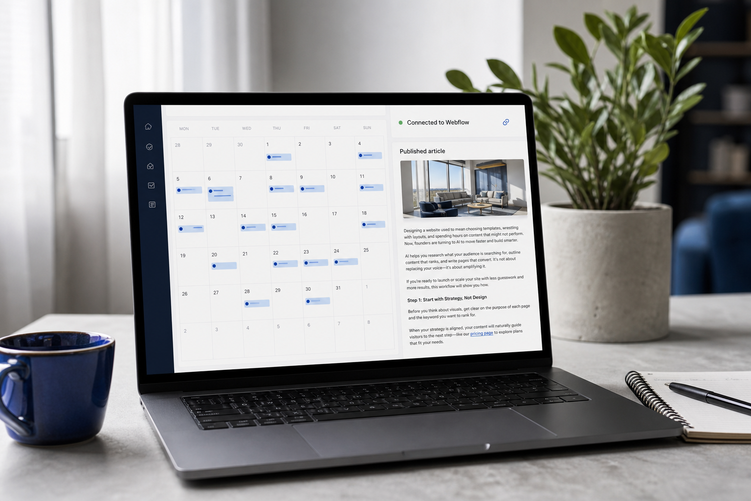
Smart internal linking is the mechanic that does the heaviest lifting. Every new blog post becomes a new internal link to a money page — pricing, demo, product. This is what makes a site rank without manual SEO work — Google sees increasing internal link equity flowing to commercial pages, which lifts those pages in rankings over time. Three months of daily publishing produces a meaningfully different link graph than a static eight-page site, and the commercial pages benefit from every single post.
You design once. The content engine keeps the site current. That's the founder advantage — build fast, stay ranked, skip the six-figure agency retainer entirely.
The cost math is direct. An agency content retainer runs $2,000 to $5,000 per month for four to eight articles. AymarTech runs at $99 per month for daily publishing. If you've already saved roughly $5,000 by skipping a designer with this workflow, the operating layer that compounds those savings costs about $3.30 per day — roughly the price of a coffee. The founder who chose to design website without designer support isn't done saving money; they're now also avoiding the content retainer that would have eaten into the runway they just preserved.
The workflow handoff at this stage is the cleanest part of the whole sequence. Design the site once using the previous steps. Plug in the content engine. Return your attention to product, sales, and fundraising. The site keeps publishing, keeps ranking, keeps converting — without you opening the builder again. That's the entire point of building this website design workflow on AI infrastructure instead of human contractors. Humans require check-ins, retainers, and back-and-forth. The engine just runs.
If you're a B2B service business specifically, the same content engine doubles as a lead generation layer — every long-tail blog post is a top-of-funnel entry point for prospects searching the problem you solve. The site stops being a brochure and starts being an inbound channel.
Common AI Website Pitfalls — and the Fix for Each
This is the section to read at 11pm when something has gone wrong. Each pitfall starts with the symptom in your words, names the root cause, and gives the fix.
Q1: "My AI-designed site looks generic. Every section feels like a template."
Root cause: prompts were broad — "design a SaaS landing page" — instead of constrained. The model defaulted to its statistical mean, which is exactly what every other founder is also getting. Fix: go back and run the Reference Stack Method properly. Lock specific hex codes, named font pairings, and a three-reference style stack. Then regenerate hero and feature imagery using the style-stacked prompt structure. The change is dramatic within one generation cycle — your hero stops looking like a template because it now references a specific photographer, era, and palette the model wasn't averaging into before. The principle is universal: vague in, generic out.
Q2: "I regenerated my homepage seven times and lost my original direction. I don't even know which version I like anymore."
Root cause: design thrashing. No locked brief, every regeneration treats the canvas as fresh. You're in a feedback loop where each new version is judged against the previous version, not against the original goal. Fix: write the archetype brief on a sticky note. Lock the design system in a Notion doc. Every prompt from now on references both. If a generation doesn't match the brief, you fix the prompt — not the brief, not the system. Cap regeneration at three attempts per section. If attempt three isn't right, the prompt is wrong, not the tool. This single discipline rule cuts most thrashing cycles in half because it forces you to diagnose instead of re-roll.
Q3: "My site has been live for three months and ranks for nothing. Did I skip something?"
Root cause: you designed for aesthetics and ignored structure and content velocity. Static sites without ongoing publishing struggle to compete in search — Google's freshness signals, internal link equity, and topical authority all reward sites that keep publishing. A pretty homepage by itself won't move the needle on an ai website builder–assembled site. Fix: install the content engine layer. Automated AI blog publishing researches the keywords the site can realistically win, publishes fact-checked articles daily, and routes internal links back to commercial pages. Three months of daily publishing produces measurable ranking shifts on long-tail keywords for most newer domains. The work you skipped wasn't design — it was content velocity.
Q4: "The AI copy is technically correct but it sounds like a robot. How do I make it sound like me?"
Root cause: no brand voice primer fed to the generation layer. The model defaulted to neutral "marketing English" — competent but generic, the kind of copy that reads as if no one in particular wrote it. Fix: write three or four sentences describing how you actually talk. Include two or three favored words and two or three banned words. Paste this primer at the start of every copy prompt. Bonus move that closes the gap further: paste a two-paragraph sample of your actual writing — a LinkedIn post, an email to a customer, a Slack message you sent that landed well — and instruct the model to match your real writing rhythm with AI. The model isn't bad at voice; it just needs a target. Give it one, and the robotic edge disappears within one generation. This is the single highest-leverage move for any founder learning how to design website with ai that actually sounds human — and it's the difference between a site that converts because it sounds like a person and a site that gets skimmed past because it sounds like every other landing page on the internet.